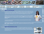
 This monthly intranet magazine site is one of the most fun projects I have ever worked on. With the client being a lively, positive company with strong branding principles it carries great satisfaction to hand a site to them every month that is technically accurate and on-brand.
There was no initial remit for the design, other than to keep to the branding rules. Hence I contacted the IT department of the client to find out details such as target browser and screen resolution before creating a pitch that was very well received.
I had the idea of changing the banner and navigation background graphics every month in order to make the site appear even more fresh when new content was added and to make each issue stand out individually.
The navigation menu is a DHTML outline list that allows the users to open up a section and navigate down the tree of content. They can choose to hide or show the content in order to focus on one or more sections and this system has proved very popular with users.
I use Macromedia Fireworks for the creation of background graphics and styling of content graphics for branding purposes. Everything else I hand code in HTML and use CSS to position box-outs and pictures, as well as maintain the site-wide consistancy required by the corporate brand.
Updated : In Q1 2002 this intranet site won an award for its design & structure. Cool!
 I created this PlayStation game fan site in early January 2001 to serve an online community that had grown from the popularity of the futuristic racing game “Wipeout.”
 The Insight intranet site was my first intranet project for this client and was a resource of information on the development of a new aircraft.